Friday, 15 April 2011
EVALUATION
Luke Irvin
AS Media Studies
Media evaluation
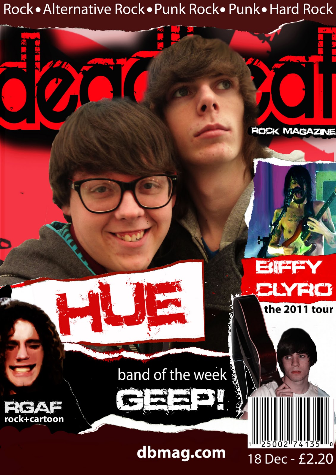
My magazine both uses and challenges conventions of similar media products. This can be seen through way the masthead is placed on the front cover. It is situated in the top-left corner, which is a frequently used convention of music magazines, most noticeably “Q”. Another convention used in my product is the banner that stretches across the middle of the front cover. This is also used many times in different magazines, Kerrang however is the magazine with who I took inspiration from. My magazine is a Rock magazine and therefore follows conventions of the Rock genre. This includes: Recklessness, smashed objects and bold, loud colours.
The front cover is full of colour, must noticeably red. Red connotes danger and passion which are both connotations of rock music. This helps back up my chosen genre. The images used on my front cover are all mid-shots, one of them however could not be controlled as it was taken at a concert that I went to. This particular image was my main front cover to begin with, however I have changed this many times and it has now been decreased in size and placed in a less dominant part of the cover due to it’s poor quality. I have also decided to include a back page as it came up many times in my audience feedback. It is nothing special and just includes a list of features in the next edition of my magazine.
My contents page follows a similar layout to that of Kerrang. It has a main image (with torn edges, following the house-style) with smaller ones surrounding it. The contents page also has an advertisement on the left-hand side, this makes appearances frequently in magazines. The colours used are also very bright and the images used are mid-shots, long-shots (this one taken from the crowd of a concert) and a close up. These have all been edited to suit the layout of the contents page. I have also included an album cover that I have designed and have allocated it to the bottom left of the actual contents page. On the opposite page (the advertisement page) I have an image of myself blended onto an image of carpet to add to the grunge effect featured throughout the magazine.
My double page spread also follows the house-style to an extent. I used the torn edge effect on the images and have a banner across the bottom of the page but I have used a different background to that of the other pages.
In nearly all the images I have taken I use a mid-shot. This is because it is simple and easy to take and will fit almost anywhere on nearly any page.
Group | Description | Old equivalent |
1 | Higher Professional and Managerial workers | A |
2 | Lower Managerial and Professional workers | B |
3 | Intermediate occupations | C1 and C2 |
4 | Small Employers and non professional self-employed | C1 and C2 |
5 | Lower Supervisory and technical | C1 and C2 |
6 | Semi Routine Occupations | D |
7 | Routine Occupations | D |
8 | Long term unemployed | E |
I have looked at particular social groups and also decided to target a similar social group as Kerrang, which are D and E (the latter of the list). These are people with either a low or non-existent income. This means that the magazine would have to be a reasonable price and so I thought that £2.20 would be just that. By doing audience feedback I found that my magazine came across as being popular with my target audience. Many of the people I questioned suggested adding a banner along the bottom of every page and so I did. However some criticism couldn’t be helped as it was too near the deadline to make such drastic changes as new and edited photos used as the main image.
Since I have based my magazine on the same conventions and characteristics as Kerrang, I feel that my product would suit a similar institution such as Bauer. This is because of the high standard Kerrang! has and I feel that a lot of passion is put into their magazines. However Bauer would also be an inappropriate institution to publish my magazine as they will also be publishing the main competitor to my magazine.
As I said earlier, the audience of my product would be mainly teenagers and students who have an interesting rock music.
To attract my audience I have included people of a similar age in the product. I have also added bold text and colours which will help draw my audiences eye to the magazine. The logo also helps with this as it will be easily recognisable.
I am extremely confident about using Adobe Photoshop. I feel I am quite skilled at it and enjoy using it. I have had experience with Photoshop in other subjects and previously before at secondary school.
I have found this task as being a great experience for me as I feel I have developed in my ability to create products using design software and I feel that I have done it to a high level. I am very proud of this magazine.
Wednesday, 9 March 2011
Wednesday, 2 March 2011
FINAL EDIT?
I made a few extra changes to this draft. I realised that I had overcrowded the page (You could only see Jake's (The boy on the left) head and therefore I felt that I should delete something. I chose to delete the album article as It took up the most room, and it wasn't even that important to the magazine. This gave me a chance to move parts of the magazine around and free it up more. The only problem I have with this draft is the large amount of blank, red space to the left of the page. I will ask a teacher for advice on what to do to this area.
My Complete Magazine
FRONT COVER
Since the previous draft of the cover I have made a few changes. The most noticable is that I have used a new main image and put my previous main image to the side. I did this as I took some new photos and thought that these would look good on the front cover.
I have also added an image that is also used on the contents page, this was only done to cover up some blank space. I may get rid of this image, depending on what my teachers think when I get feedback from them. I also included the website at the bottom of the page.
CONTENTS PAGE
I haven't made any changes to my contents page as I was very happy with how it looked to start with.
DOUBLE PAGE SPREAD
This is my first and final draft for my double page spread. I did a similar thing to how I designed my contents page, which is look at a double page layout that has been done by kerrang and then made it my own. I used a scrumpled peice of paper as my background and to make it more professional I added a black layer over the top, and blended it in. I have kept to the same fonts that have been used throughout the magazine.
I also quickly made an album cover to feature on it, this didn't take me long to do. Overall I am very happy with this and do not plan to make any further edits.
Thursday, 17 February 2011
Contents Page Draft
![](https://blogger.googleusercontent.com/img/b/R29vZ2xl/AVvXsEhIeCJfAnHsHbTkKL1yC8oCl26Mpgyzwe1myUUPxXQo17z8r_A47biWcKabans5oMgk0XO7ID1w1RgVEzZ0ogyK4darQoT6TAMYWNiaJjKyo-GOTjLjKMeCwLT2YlohEBM9-K8-p0F3WRE/s400/Contents.jpg)
![](https://blogger.googleusercontent.com/img/b/R29vZ2xl/AVvXsEhnRupH_ToXrMuHn98rbTzwDkF484utVcsd4ZlVUJ_w1WMTxbww9nXi9_vB4ZiCXqRp6wwC9pUjqYCtx3QQknkL38k5H-Ixfi6Yf4RRsG0V6VrHNmtVD4XV2qhy3_ETOwtARlOIfaTxNMs/s400/kerrang_001.jpg)
This is my first contents page draft and I am hoping it will be my last as I really like this design. I used a copy of a kerrang contents page as a template and then placed my own imagery over the top. I then altered some of the layout to make it my own. Instead of using a plain white background; I took a picture of some scrumpled paper then added a red effect over the top. I also carried on the ripped paper effect I used on the front cover but I changed the ripped papers colour from red to black and white.
Front Cover Draft
Subscribe to:
Posts (Atom)