
Wednesday, 9 March 2011

Thursday, 3 March 2011

Wednesday, 2 March 2011
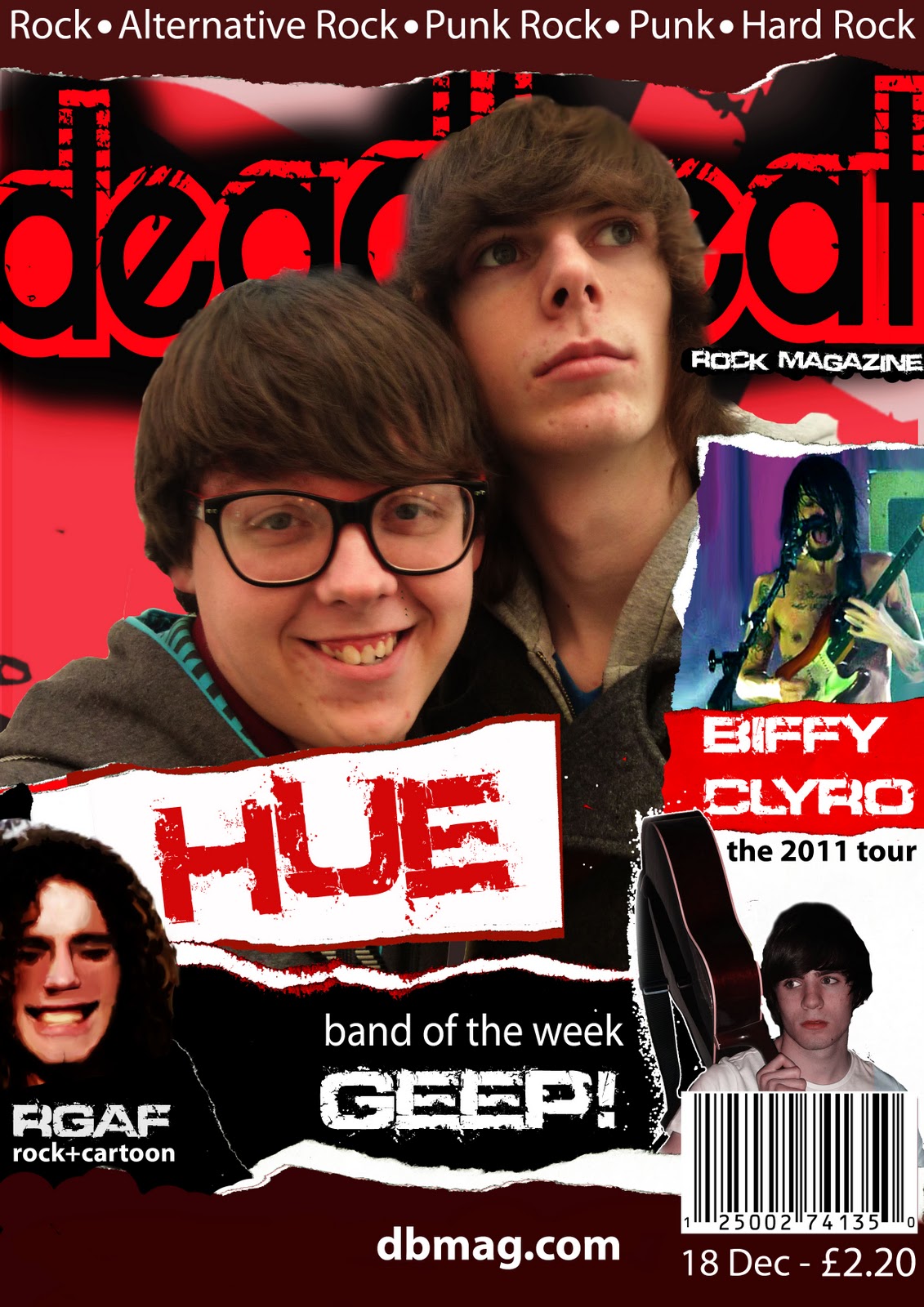
I made a few extra changes to this draft. I realised that I had overcrowded the page (You could only see Jake's (The boy on the left) head and therefore I felt that I should delete something. I chose to delete the album article as It took up the most room, and it wasn't even that important to the magazine. This gave me a chance to move parts of the magazine around and free it up more. The only problem I have with this draft is the large amount of blank, red space to the left of the page. I will ask a teacher for advice on what to do to this area.
My Complete Magazine

Since the previous draft of the cover I have made a few changes. The most noticable is that I have used a new main image and put my previous main image to the side. I did this as I took some new photos and thought that these would look good on the front cover.
I have also added an image that is also used on the contents page, this was only done to cover up some blank space. I may get rid of this image, depending on what my teachers think when I get feedback from them. I also included the website at the bottom of the page.

I haven't made any changes to my contents page as I was very happy with how it looked to start with.

DOUBLE PAGE SPREAD
This is my first and final draft for my double page spread. I did a similar thing to how I designed my contents page, which is look at a double page layout that has been done by kerrang and then made it my own. I used a scrumpled peice of paper as my background and to make it more professional I added a black layer over the top, and blended it in. I have kept to the same fonts that have been used throughout the magazine.
I also quickly made an album cover to feature on it, this didn't take me long to do. Overall I am very happy with this and do not plan to make any further edits.
Subscribe to:
Comments (Atom)